


Many moons ago, when I first started working at the University, a fellow colleague was giving a presentation on her research. We were in a medium sized seminar room with the lights slightly dim. The room was half full of academics from all different disciplines, eager to hear about her study. She was engaging and well prepared. Then out of nowhere, we heard this noise. The room stopped and turned. The presenter, professional as ever, kept going, but was visibly distracted. What had happened? Another colleague had fallen asleep and started snoring! Yes, a lunch time session, with the lights slightly dim, had put this poor man to sleep.
We’ve all been to those seminars where the presenter starts talking and the slides are full of dot points. Do you read the dot points, or listen to the presentation? You decide to read, tuning out the speaker and then they change the slide! The next slide appears and besides it’s six multi-level dot points and two different fonts, your attention is competing with the unnecessary clip art, the four different organisational logos and a heading that’s two sentences long with a distorted photo in the background. What is going on?! Time to check emails or even see what’s happening on your social’s news feed.
I have a love-hate relationship with PowerPoint. On the one hand, it’s a great tool to use for your presentations, but the majority of people are using it incorrectly.
What’s my issue with PowerPoint? The minute you open the program, it guides us into bad habits. The first slide prompts you to “click to add title”, and then “click to add subtitle”. The next slide “click to add title”, “click to add text”. But what format are you adding the text in? The evil dot points (or bullets)!

PowerPoint guiding us into bad habits.
Please don’t get me started on the horrible templates they supply either.
The majority of people put the information in and never go back to reformat it, so pages and pages of dot points remain (probably copied and pasted from another document).
Here is my first take away point:
Your presentation is not a 50/50 split between you as the presenter and your PowerPoint presentation. You are the presentation and PowerPoint is your visual aid. Your slides shouldn’t make a lot of sense without you there talking to them. If they do, you probably have too much information on them.
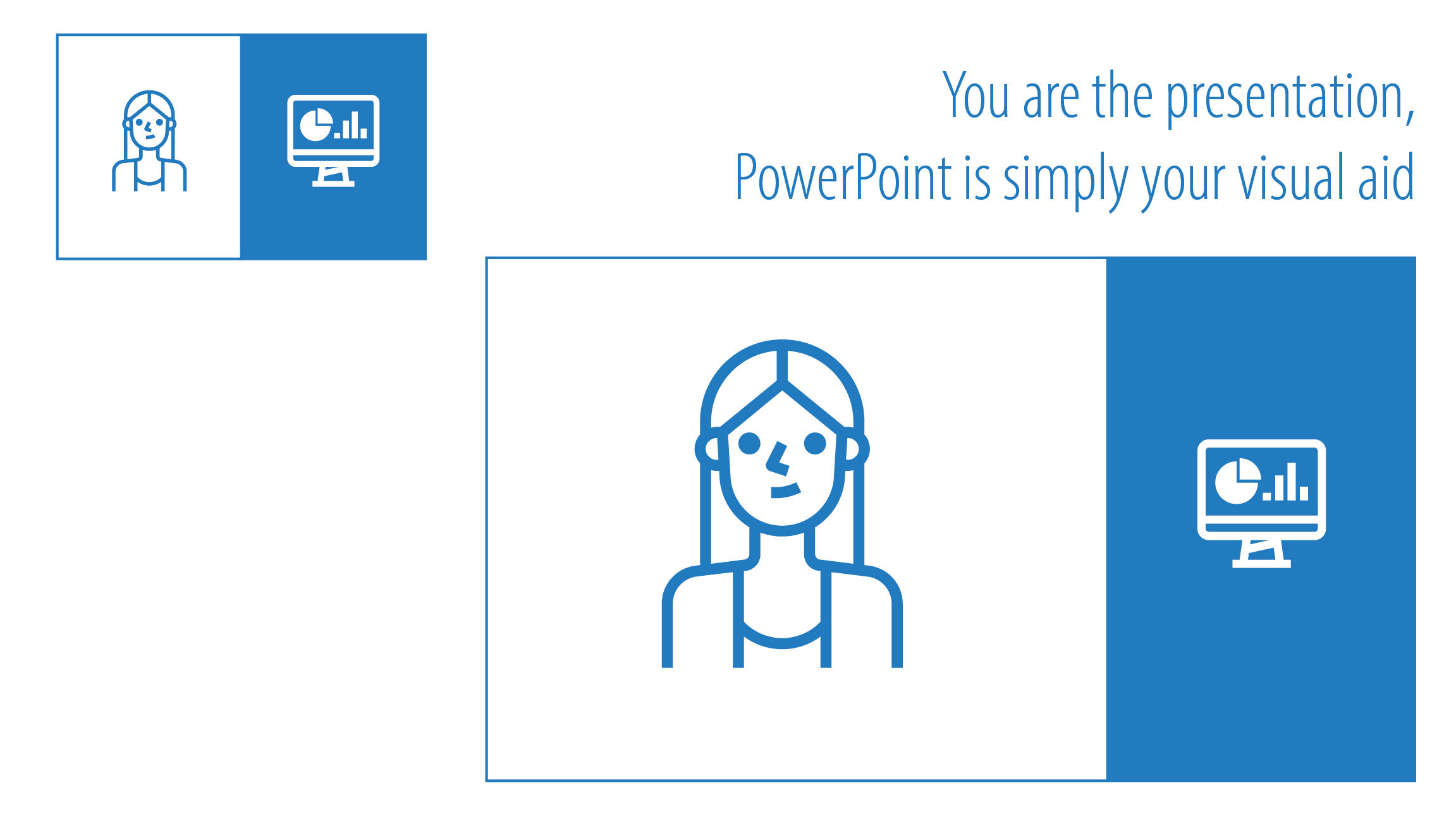
PowerPoint is your visual aid
For the majority of us, presentations are challenging. You have a set amount of time to not only condense your topic but also present it in a way that’s engaging and easy to understand. So naturally we start going through and planning what we are going to talk about on each slide, succumbing to the evil dot point format.
That’s fine and a good way to start planning, but it’s only half the job. Don’t stop there.
Second take away point:
Once you have planned what you are going to speak about on each slide, move ALL this information into the notes section below. Now you can start to design your slides.

Use your notes section below
When you start designing, make sure you start with a blank slide. This way you won’t succumb to PowerPoint’s nasty dot point trap.

Start designing with a blank slide
Add an image, a few words or icons that illustrate the point you are talking about. Don’t be scared to stretch what you originally had on one slide over three or four. Each slide should cover one main message.
Use images. People connect to images, especially images of other people’s faces.
Why is this so important?
In his brilliant book Brain Rules, John Medina tells us that if you show someone a chunk of text, they are likely to recall 10% of that information three days later. If you combine that text with a relevant image, they are likely to recall 65% of that information three days later.
Third take away point:
Move away from dot points.
My challenge to you: create a presentation that has no dot points in it at all. It is possible! My one-day short course has over 500 slides with only one slide with dot points – and that’s an example of a ‘before’ slide. Dot points are the biggest mistake people make.
My last take away point:
Make a great first impression on your first slide.
At a conference or presentation, your first slide is likely to be on display for a while. It will be on screen while people walk into the room and wait for you to start. Make them excited about your presentation the minute they see that slide. Don’t clutter it with unnecessary information or clip art.

Five elements for your first slide
There are the ONLY five elements I believe should be on your first slide.
Title – a short, sharp title is better than 2 whole sentences.
Image/photo – use a high quality stock image. There are many sites like pixabay where you can get these royalty free.
Name of the presenter ONLY. You can name all your collaborators on the next slide. People want to know who is presenting in this instance.
Your institution
Your institution’s logo. This should be on your first and last slide only. If you are engaging enough, people will remember where you are from. You don’t need to remind them on every slide.
Here are some examples.

Before and after

Opening slide design

Opening slide design
I could write a book on designing PowerPoint presentations. There is so much more you can do than jotting some dot points on a page.
Design something that’s exciting. Design something that’s engaging. Design something that wouldn’t make much sense without you there to talk to it. Don’t be scared of white space. As the famous saying goes, “less is more”.
Take your time designing. People often don’t realise how time consuming putting together a well-designed PowerPoint actually is.
And remember not to use dot points!