

Getting people excited about a table or an Excel spreadsheet isn’t an easy task. Usually, they are filled with rows and columns of numbers upon numbers and people’s eyes seem to glaze over when presented with one. There are a few simple design elements you can incorporate into your Excel sheets to make them easier for your audience to navigate.
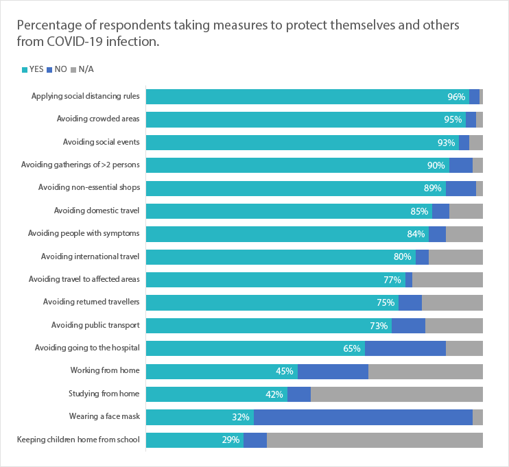
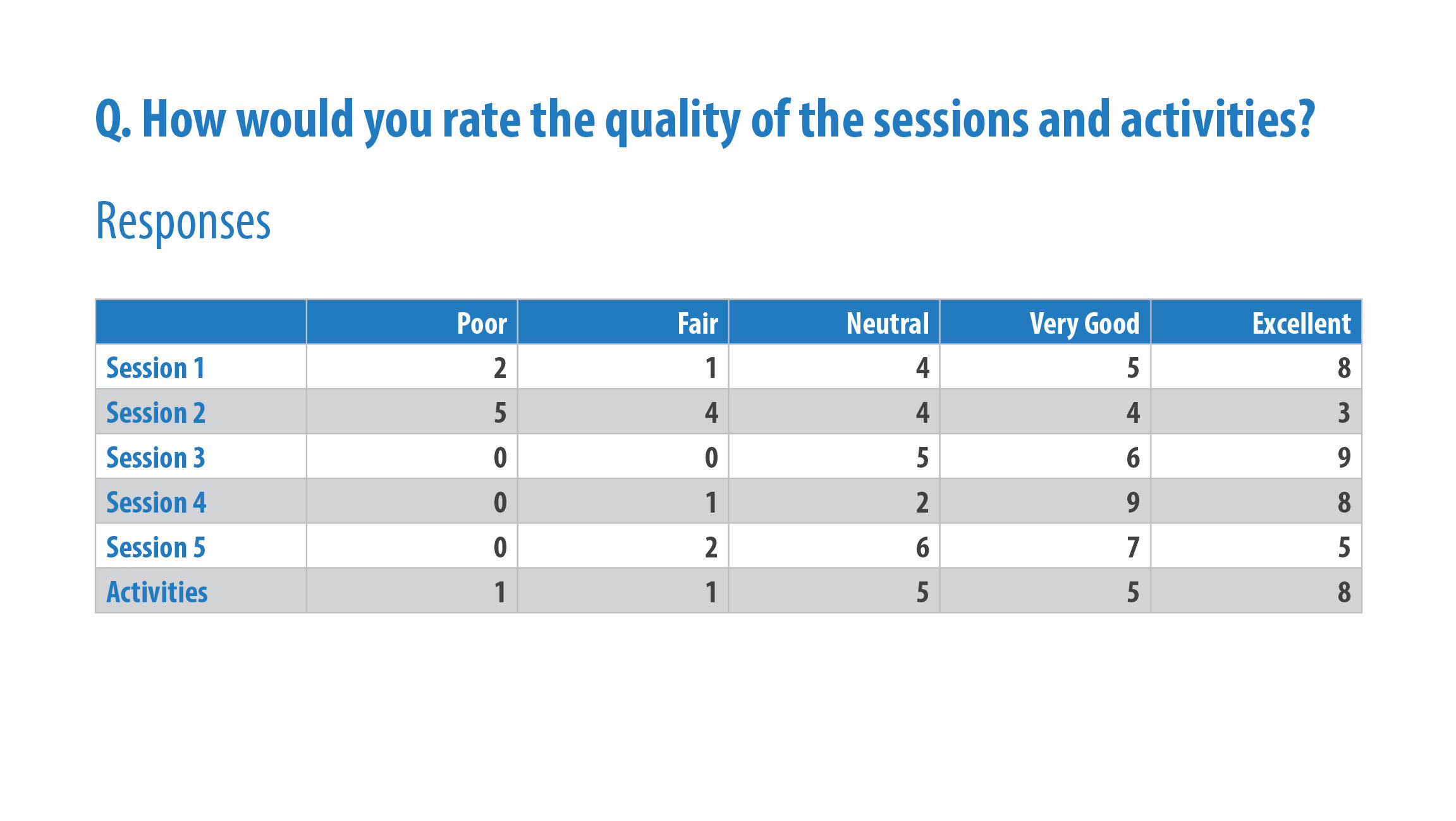
I came across this table in a university report recently which looks at their performance in several metrics over the last five years. Whilst the table is better than your standard Excel spreadsheet, I thought I could take it one step further and create something worth getting excited about.
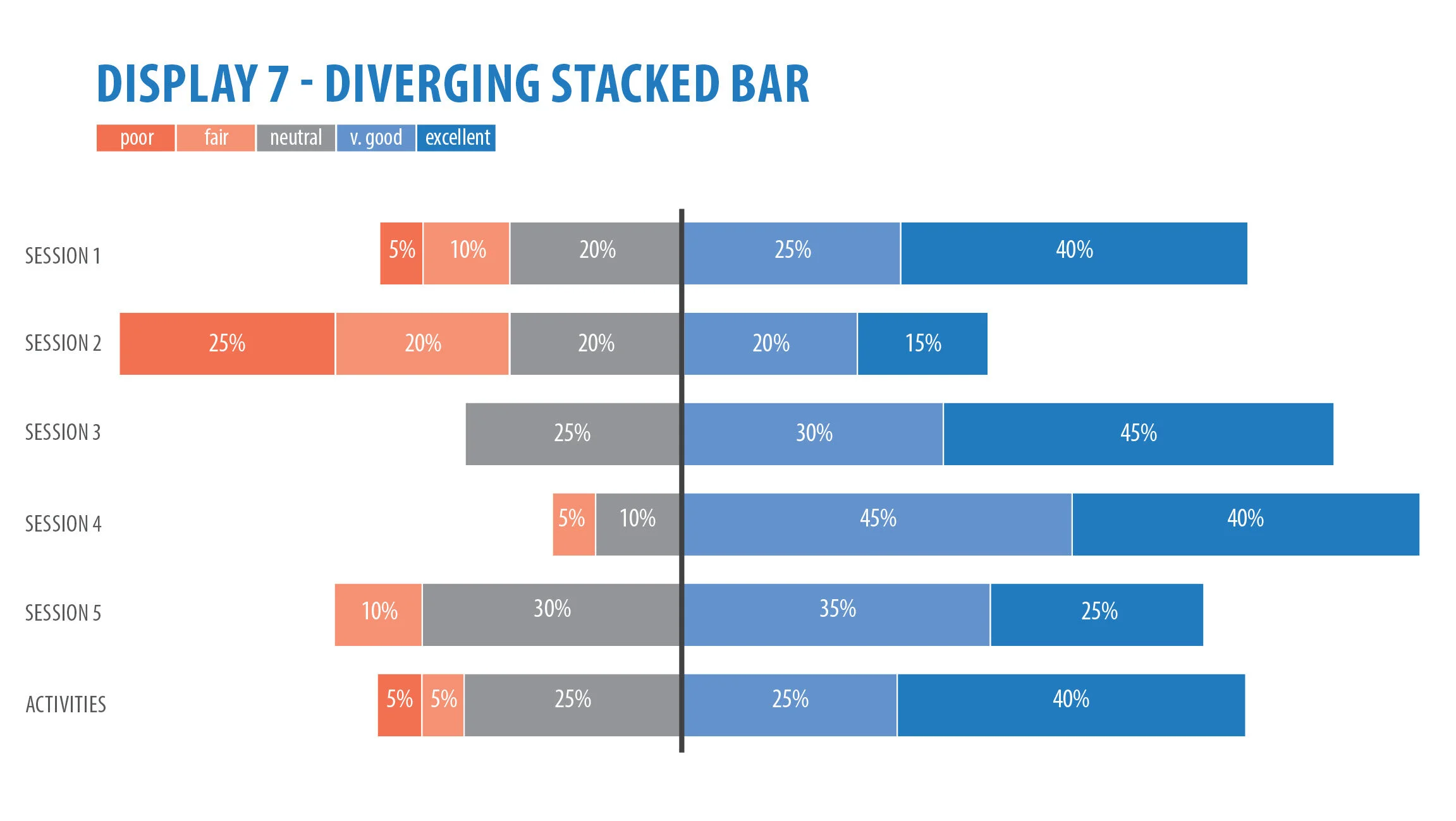
Let’s go through 5 rules for redesigning tables.

BEFORE. University table.

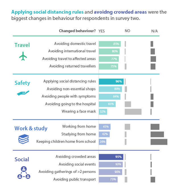
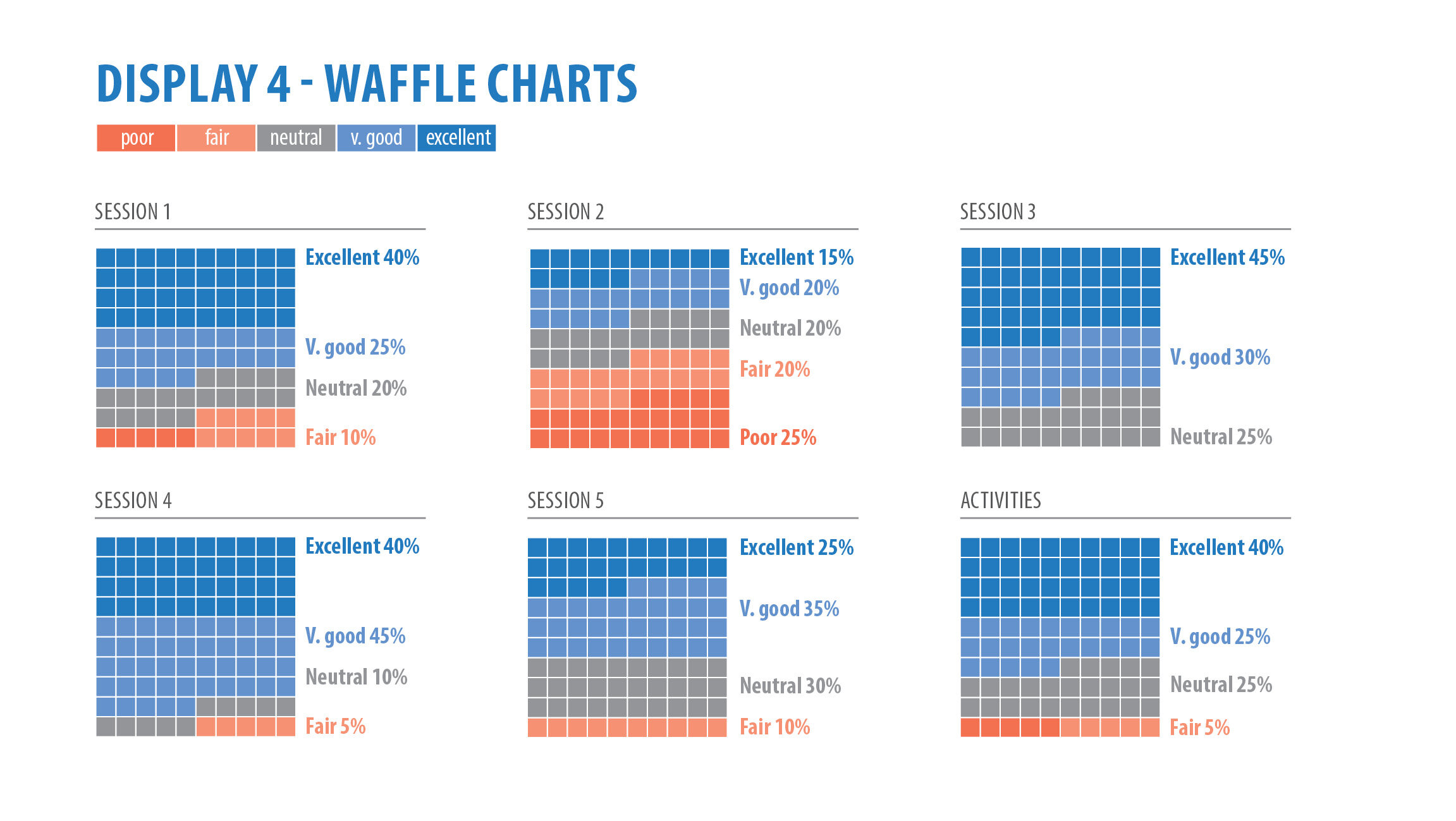
AFTER. Redesigned table.
Text Hierarchy
Creating hierarchy is vital in any design output you produce. We need to make a clear and organised way for our audience to navigate through the layout. Usually the largest and boldest part will grab our attention first and be the most important, with the smallest and lightest being least important.
In our table design, we can establish a text hierarchy by making the title a large, bold font and position it in the top left corner. That’s where we want our audience to start reading. Our next level of text hierarchy is the row headers and column headers. I have designed these in a slightly smaller font than the heading but still bold and coloured. Using the colours helps separate them from the rest of the data and helps create different sections. Level 3 are the row sub headings. They are the same size and colour as the body text but are in bold. The rest of the data in the table is our forth level of hierarchy known as the body text.
White space
“White space is used to group data objects that belong together by separating them from others” – Stephen Few, Show me the Numbers.
White space acts as breathing room. It’s not enough to make sure there is white space between the columns on an Excel spread sheet, but also consider white space between rows. That helps your audience read through the rows more efficiently. If rows of data are too close together, we have more difficulty tracking across the row without getting it confused with other rows. In ‘Show Me the Numbers’, Stephen Few suggests having the row height double the size of the text within the cell. For example if I’m using 10-point font, my cell height should be 20-point.

Row height should be double your font size.
Gridlines
According to Stephen Few, gridlines should run either horizontally or vertically and should not intersect.
In the redesigned table, I’ve used a thick grey line (or rule) to separate sections but have chosen not to use one within the sections as there are not too many rows of data and there is enough whitespace in between.
With a very dense table without many sections, you may consider using banded rows where every second row is lightly shaded.
Alignment
As a quick rule of thumb, all text should be left aligned, and all numbers should be right aligned. Obviously, there are exceptions to this rule but in most scenarios, this works best. Avoid using centre aligned columns, especially for text as it’s a lot more difficult for our eyes to scan through the data with jagged edges.
The column headers should share the same alignment as its column, regardless of being text or numbers.
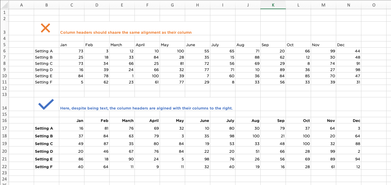
Column headers should share the same alignment as its column, regardless of being text or numbers.
Sparklines
Sparklines were created by Edward Tufte and are described as "small intense, simple, word-sized graphics." They are a perfect addition to a number-heavy table to show trends in the data. In the table above, I have used two sparklines, line and column. My intention in using sparklines was to enable to reader to quickly scan through the content to find what they need, or in this case what I want to tell them. I have highlighted the “high point” in each sparkline to see how they compare in each metric over the five years, and which year was most successful. This highlight colour works best when the rest of the sparkline is coloured grey.
It should be noted that the Y axis of the sparkline is measured by the highest and lowest point of the data in that particular row. Therefore, it may not be accurate to compare between sparklines. If you want a consistent axis throughout, you can change this under the sparklines tab by clicking axis > vertical > and select same for all sparklines under minimum value and maximum value.
A few other points to consider:
Use a dark grey text instead of black, especially if you are using an action or highlight colour. It loses that stark contrast between numbers and sheet and allows our highlighted colour to have more visual impact.
Use only one font and preferably a sans-serif font. It’s a lot easier to read.
If you are using dates, be consistent. For instance, if you are writing 1st April 2021 write 01/04/2021 not 1/4/2021. This will line up numbers better in your columns.
Happy designing!