

Check out this line chart below. As the title suggests it’s looking at AFL club membership from 2016 to 2020. It’s extremely busy with 18 different lines and colours that are awfully similar. It’s hard to gain any insight from the chart (besides that fact that it’s quite busy), let alone focus on any single data series. What if I asked you to tell me how club membership was affected by COVID-19 from 2019 to 2020? Which clubs did well? Which ones lost members? What was the overall trend? It’s virtually impossible which makes the chart pretty useless.
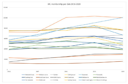
Extremely busy line chart
Luckily, we can redo this chart using small multiples instead.
What are small multiples?
The term was popularised by Edward Tufte and as he describes “resemble the frames of a movie: a series of graphics, showing the same combination of variables, indexed by changes in another variable.” They are also referred to as trellis, lattice, grid or panel charts. They are an efficient way to break down a busy chart that allows your audience to walk through one category at a time and make comparisons.
So let’s redo this chart using small multiple line charts.

Small multiple line chart
What have I done?
I’ve created an individual chart for each team showing membership numbers over the last five years. Each chart is to the same scale, which is incredibly important so we don’t mislead our audience. I have decided to colour code the chart with orange used for membership decline over the previous season and blue to indicate membership growth. I have then finished this off with a descriptive title and subtitle at the top which turns my chart from an exploratory chart to an explanatory one (i.e. I’m telling you what my take away message is). Lastly, I have listed my source down the bottom. Has this redesign made it easier for you to understand and interpret the data?
Let’s try another design using small multiples area charts. This time I will incorporate data storytelling.

Small multiple area chart
I’ve pushed everything to the background using grey. I’ve then decided I’ll focus on membership decline once again and highlight that using a bold red colour (a little alarmist, but intentional given the circumstances). I’ve used a complete sentence to highlight my story and colour code it to the chart. Lastly, of course, my source at the bottom.
Depending on where I am using the chart (a report or PowerPoint presentation), I may want to give context that Melbourne was hardest hit by a second wave of coronavirus and teams were moved to hubs predominately in Queensland. Additionally, no Melburnians were able to attend live games within Victoria in 2020.
How have I done these small multiples?
Great news, it’s all in Excel! Highlight and create your first chart with only the one category.

Screenshot of Excel
Once you have formatted it the way you want it, right click and save as template. Then copy and paste your chart however many times you need to. In my case, it was 17 more times. Lastly right click on each chart and choose “select data” to populate the new data.
Small multiples can be used for just about any type of chart. My blog on displaying Likert scale data uses a few more examples.

Small multiple bar charts

Small multiple waffle charts
If you need some further inspiration that’s not football related… (I had to, it’s September!), check out these links.
Financial Times: Coronavirus tracker
McKinsey & Company: Tracking US unemployment through the COVID-19 crisis
Happy designing!