
Word clouds were big 9 or 10 years ago, thanks in big part to the online application Wordle.
It only takes a quick google search of ‘word cloud’ to see how popular they were and how we absolutely used them to death. I too, am guilty of it. I’m pretty sure I created one for our annual report back in 2010 (we won’t speak of this again). Now when I see a word cloud used as a visualisation, a cold shiver goes down my spine.
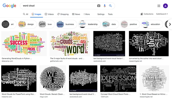
A Google search of ‘word cloud’
However, there are some exceptions. I will get to this in a moment.
What is a word cloud?
In case you don’t know (or have been cast away on a desert island for the last 10 years… welcome back), word clouds are an image composed of source text that you input into a program or online application (like Wordle). It then creates an image of the text, scaling the words by how frequently they are used. You can then change the font, colour palette and layout.
They were cool, but very overused. People would dump paragraphs of text into these programs without a second thought. They can be hard to pull any meaning from and we only really pay attention to the few big words. Phrases would lose all meaning unless you grouped the words together.
I do however think there is some value left with word clouds. Hear me out…
What are they good for?
They are a good tool for qualitative analysis when you are making comparisons. Before and after, 2018 vs 2019 etc.
We used it to do a qualitative analysis of the Survive and Thrive program, which was an environmental education program delivered by the local CFA to school children in Anglesea. The paper can be found here - https://files.eric.ed.gov/fulltext/EJ1173481.pdf
We used a visual mapping exercise where children were asked a series of questions about what they would do in a bushfire and who would they give information to. This was done over two time points, before and after the CFA training.
We then used word clouds to draw comparisons between the two time points. See image below.

Example of a word cloud to make comparisons with qualitative data.
Why was it a success? Well, we can easily pull meaning from the before and after images. I have kept the same font and colour palette and we are not flooded with words.
This paper was published in 2014, and I would probably do things differently again now if I had the chance. Some of the word clouds used in the published article had words written both horizontally and vertically. The minute we change the angle of the text, the longer it takes to read and process. So I would keep all the words written horizontally.
There is one other occasion where I used a word cloud and that’s during my Design and Data Visualisation Short Course. In the PowerPoint session, I demonstrate some cool interactive tools that make your presentations more engaging. One of those is Poll Everywhere. We use it to ask questions and vote on important things (like - do you like coriander…) but I use word cloud to ask participants to use one word to describe how they are feeling about today’s course. All the answers are anonymous and they begin to appear on the screen in front of them.
Below is a screen shot from my August course. I’m just relieved no one said bored!

Word cloud used for August short course.
If I haven’t convinced you there is worth left in the old word cloud, some other ways to represent qualitative data include the following:
· Spectrum display
· Heat map
· Quotes
· Images
· Bold text with an action colour
· Gauge chart
· Sunburst
· Mind map

Ways to display qualitative information
Keep your word clouds simple with consistent font and colour palettes and only use them for comparative purposes.
And how’s this for irony, the journal that the Survive and Thrive paper is published in has the following logo…